The GUI is really unusable in professional enviroment. Please make a professional clean and lean design to choose.
Can you describe more about professional environment? What does it mean?
Hello YSH,
thank you for you answer.
We use NetDrive as a tool to access over 18 different DAV drives (different locations and customers). The “old” Version 2 was much cleaner, with smaller typos, icons, buttons aso and with a very light color scheme (mainly white background, one icon and a Connect Button).
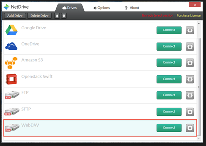
The new GUI looks super colorful with everything written on a colored background. The typo is very big. It look a little like an candy shop or like a toy for kids.

It would be nice if there was an option to have it a small font version with a two line setup for each drive
FTP I: ftp://199494949 config log Connect
Google Drive D: ward@sdfjl.de config log Connect
…
Best regards
Oliver
···
Von: Hoon [mailto:no-reply@bdrive.com]
Gesendet: Donnerstag, 11. Januar 2018 14:24
An: Oliver Pressmar webmaster@pressmar.de
Betreff: [Bdrive Discourse] [PM] A post in “Design Overlook” requires staff attention
ysh
Bdrive Staff
January 11
Can you describe more about professional environment? What does it mean?
Visit Message
or reply to this email to respond.
To unsubscribe from these emails,
click here.
Thanks for your explanation. NetDrive is used by many users and most of the user has no more than 4 or 5 drive items. When you tell me ‘professional environment’ I assumed that you must be using far more than that and I was right. 
We will talk about your suggestion but I cannot confirm any timelines.
This topic was automatically closed 7 days after the last reply. New replies are no longer allowed.